Visual Style Guide

Last updated: December 2023

What Is This?

This a snapshot of The Markup's visual style. Naturally, and like most organizations, The Markup's visual style is never “done” and will continue to evolve.

Use this guide to help you represent The Markup visually. However, all is subject to change.

What is covered?

InfluencesOS' and Circuitry Diagrams.

FundamentalsColors, Typography, Logo.

Elements of StyleLayering, Shadows, Rules, Arrows.

ImagesSizes, Illustration, Screenshots.

GraphicsPhilosophy, Structure, Annotations.

Influences

OS' and Circuitry Diagrams

There are two major influences or references we consistantly make through our branding. The first is a more obvious reference to old operating systems. A good example where this is present is on our dialog style boxes, with its hard outlines and shadowing, that we use to provide emphasis to parts of the UI. Or when you successfully donate to The Markup.

The second is in the subtle references to circuitry diagrams. The reference talks to the fact that The Markup explains and exposes algorithms and other complex systems. This can be seen most prominently on the home page where a page-long arrow links all of our stories together. However, it is also present across the UI to provide annotations and direction for the reader.

Fundamentals

Colors

These foundational colors are core to the Markup's brand and site design.

Click on a color to copy to clipboard

  • Navy

    #242a49

    Copied!

    Used instead of black or dark gray. The darkest color in a graphic. Default color for type.

  • Pink

    #ff335f

    Copied!

    Our most distinctive color. Should be used sparingly and as a highlight, to draw the eye to the most significant feature on a graphic. Should always be the most eye-catching element in a graphic.

  • Light Pink

    #fbd7de

    Copied!

    Light Pink can be used when you want to draw the user's attention but not scream about it.

  • Tan

    #66615B

    Copied!

    Tan is often used for secondary pieces of information and meta.

  • Light Tan

    #f3f2f1

    Copied!

    Light Tan should be used as a background color only.

  • White

    #ffffff

    Copied!

    White is used for backgrounds of content and for light text on darker backgrounds.

  • Light Blue

    #e6f3ff

    Copied!

    Light Blue is rarely used in UI. It's more of an extra color available to graphics.

  • Highlighter

    #dffe5a

    Copied!

    Highlighter is strictly limited to text selection.

For graphics, illustrations, and broader design work, a more expansive palette is available.

Click on a color to copy to clipboard

    Pink

  • Pink

    #ff335f

    Copied!

    Light Pink

    #fbd7de

    Copied!

  • Blue

  • Navy

    #242a49

    Copied!

    Lead

    #4F5273

    Copied!

    Slate

    #7B89A1

    Copied!

    Dolphin

    #AEBDCF

    Copied!

    Light Blue

    #e6f3ff

    Copied!

  • Red

  • Crimson

    #801930

    Copied!

    Red

    #A8596D

    Copied!

  • Purple

  • Purple

    #69366A

    Copied!

    Plum

    #9B729C

    Copied!

    Lavender

    #9C98B2

    Copied!

  • Orange

  • Orange

    #F0B36C

    Copied!

    Sand

    #E0C09B

    Copied!

    Peach

    #F7E3CC

    Copied!

  • Green

  • Turquoise

    #22D0AF

    Copied!

    Green

    #199A82

    Copied!

    Mint

    #9AD0C5

    Copied!

  • Tan

  • Tan

    #66615B

    Copied!

    Light Tan

    #f3f2f1

    Copied!

Typography

  • Ivar Display

    Ivar Display is limited to headlines and large numbers. A modified version of this font is used for our logo, and as a result, this typeface shouldn't be used, as is, in place of our logo.

  • Ivar Text

    Ivar Text is used for body copy and other important paragraphs.

  • Messina

    Messina is used for data, small print, and general secondary information. We can use both Regular and Bold weights, although Bold should be reserved for emphasis and come with a color change.

Only use our logo in the following three colorways.

Download JPG, PNG and SVG versions of all logo variants

  • Primary representation of our logo. Mainly used on-site

  • Mainly used off-platform and in places where we want our presence to stand out

  • Alternative colorway to be used when a darker background is required

Things not to do with our logo

  • Don't re-create using Ivar Display typeface.

  • Don't encroach on the logo's space.

  • Don't stack.

  • Don't remove the definite article.

  • Don't alter the alignment of the words.

  • Don't spin the logo around.

Elements of Style

Layering and Shadows

Layering and shadows should be used for providing emphasis to certain elements of the page. Naturally this means they should be used sparingly.

Layering is used only for buttons. On hover the button's layers should rise before being pressed. Hover over the button to see it in action.

Shadowing is mainly used for providing emphasis to elements like images and panels with interactions.

Shadows and layering should always originate from the 45-degree light source, highlighted here with the arrow. Shadowing should always use the dot pattern and never be a full colored block. This dot pattern should be one dot in a 3px-by-3px grid, with the shadow as a whole being offset by 12px.

Rules

Big four dot dividers should be used to indicate major changes of section or content.

Light solid rules are used for dividing up parts of the UI. Usually in 40% tan.

Single rules are generally reserved for grid lines in graphics.

Arrows

Arrows should be used to draw attention to data or interactive elements.

Arrows can be straight lines that follow right angles or they can be 90 or 180-degree curved arrows.

Images

Sizes

3200x1800 – Illustrations, photography, etc...

1280x720 – Screenshots should be taken at this size on desktop. Ideally on a retina display.

3200xXXXX – Left or Right aligned images amongst copy. Note the variable height

Illustration

The Markup's illustration style can be quite broad and naturally has to shift depending on the story. Illustration at The Markup shouldn't simply look nice, it should tell part of the story and set the tone. With this in mind we tend to commission art with visual concepts behind them, often with a slightly cheeky tone.

Illustration should be...

  • Clear
  • Conceptual
  • Talk to the headline or main themes
  • Set the mood for the piece

Illustration should not be...

  • Someone using an UI on a device
  • Incredibly detailed so it doesn't work on mobile
  • Made of common cliches of tech illustration (binary code, hackers wearing face masks, etc...)

Screenshots

Screenshots are incredible useful for visual emphasis and proof of our reporting. However, there are a few rules around taking screenshots. Other extensions are available, but I use Window Resizer to size the window at 1280x720 and then Awesome Screenshot to take the actual screenshot.

Try to be clear in what you are screenshotting. We can caption and/or highlight parts but it's cleaner if the screenshot can speak for itself. Also try to avoid identifying information like names, avatars, addresses, etc...

Graphics

Philosophy

While data viz can be art, our graphics should be clear and easy to understand. For that reason, The Markup's graphics tend to take more traditional rather than experimental forms.

Structure

Concise, accurate text is as important to a chart as the visual elements.
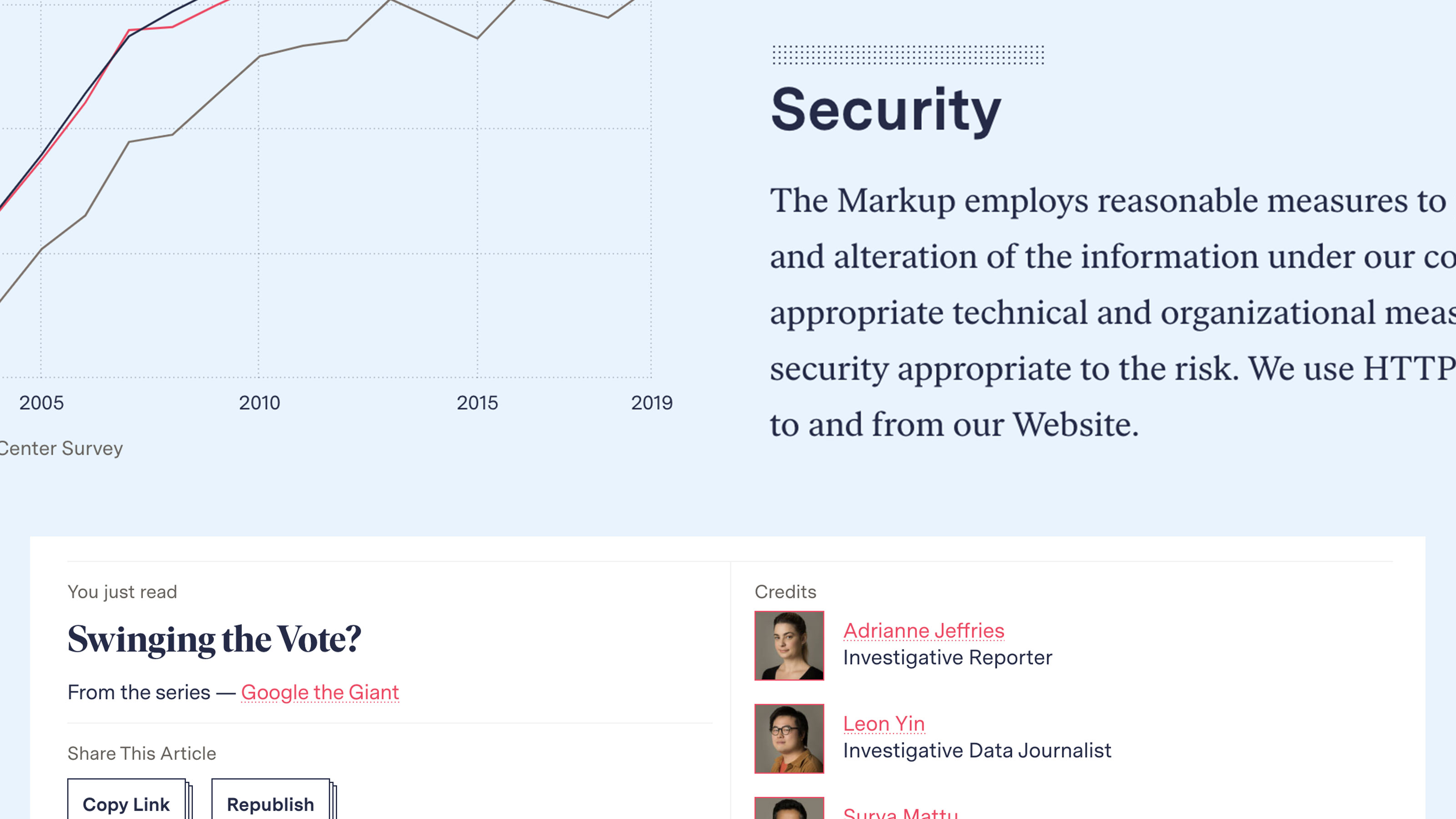
Title (or Heading)
A short sentence that describes the main takeaway for the graphic. Written in sentence case, with no end punctuation unless in question form, the chart title should summarize the key takeaway of the chart in a single approachable statement.

Subheading
A technical description of what the visual in the chart is showing, usually also with no end punctuation.

Note (optional)
If needed, additional caveats and context to the visual, such as a date range or the sample size of a study.

Source
The underlying source of the data being visualized. If the chart combines data from multiple sources, separate each source with a comma.

Link to data (optional)
A URL for the source data. A link can be added to the source or to an additional note (e.g., see our data here).

Byline (optional)
The author or designer of the chart.

Alternative description
A description of the visual which will be read aloud by a screen reader. Ideally a concise summary that doesn’t duplicate the existing header text, but describes the meaningful takeaway of the visual content. See examples

Colors and scales

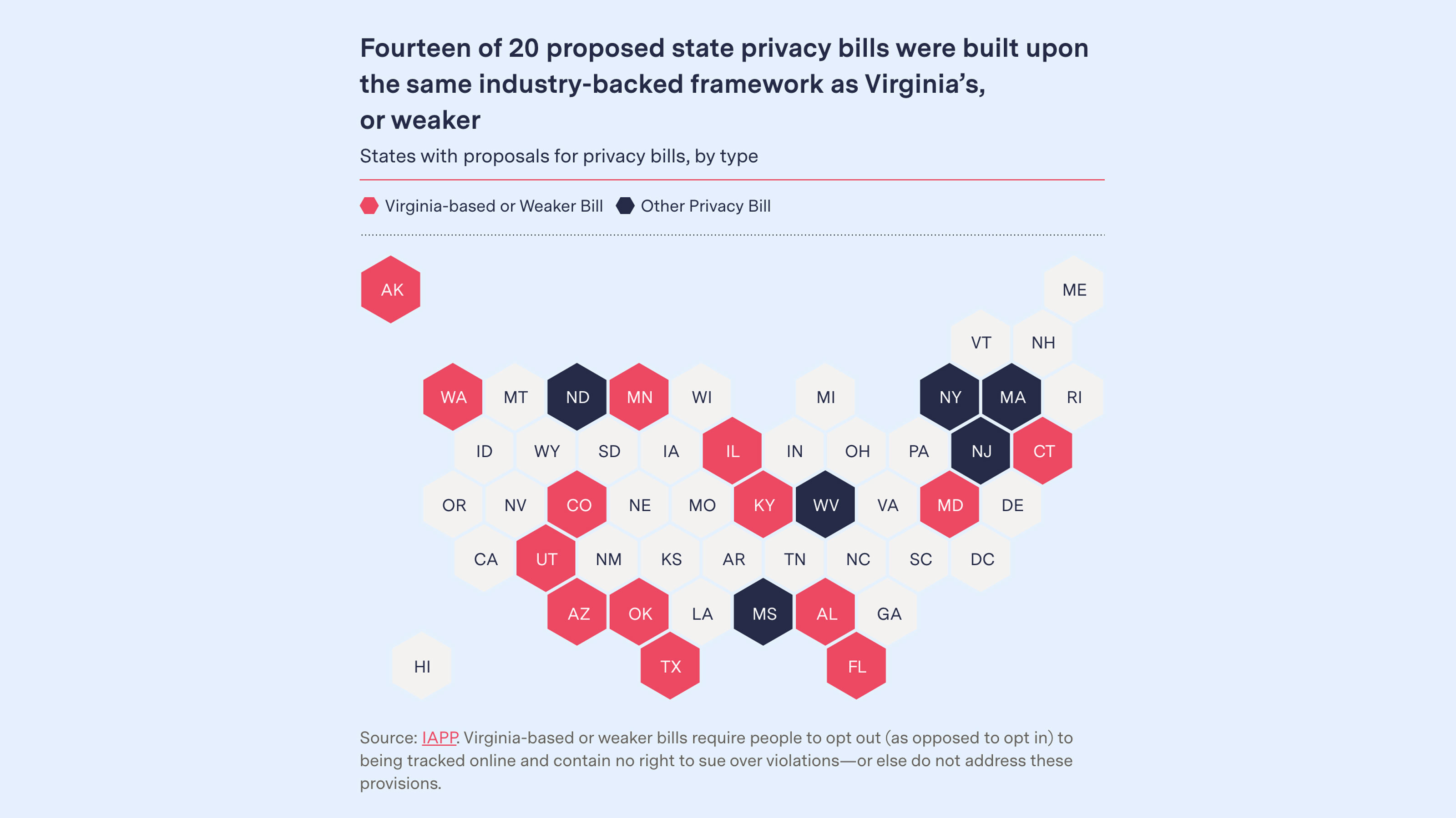
As a baseline, a graphic should have one dominant highlight color (such as our pink or navy) that directs the reader’s attention to the most important element. Blues and tans are used for elements of secondary importance.

Annotations

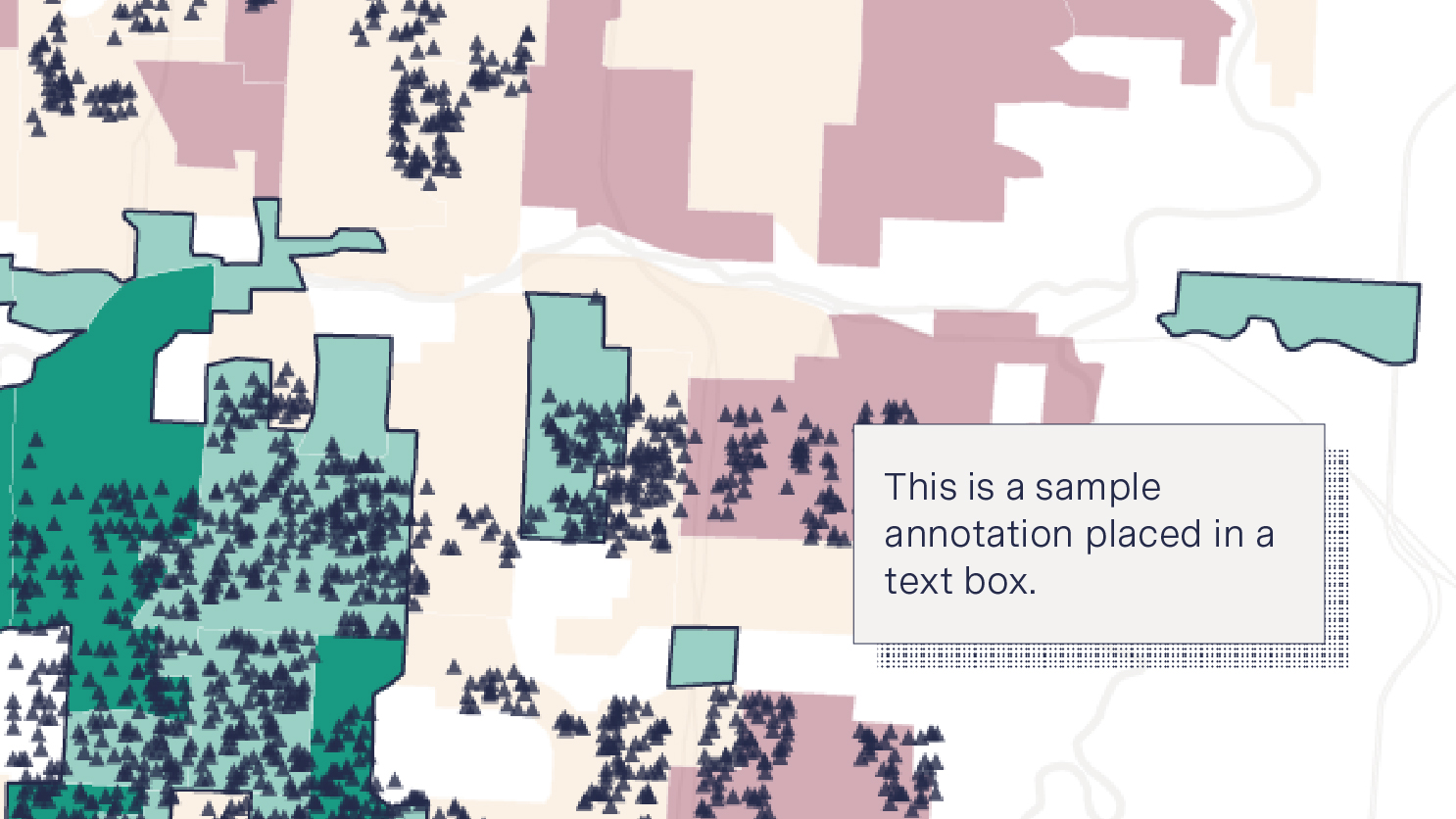
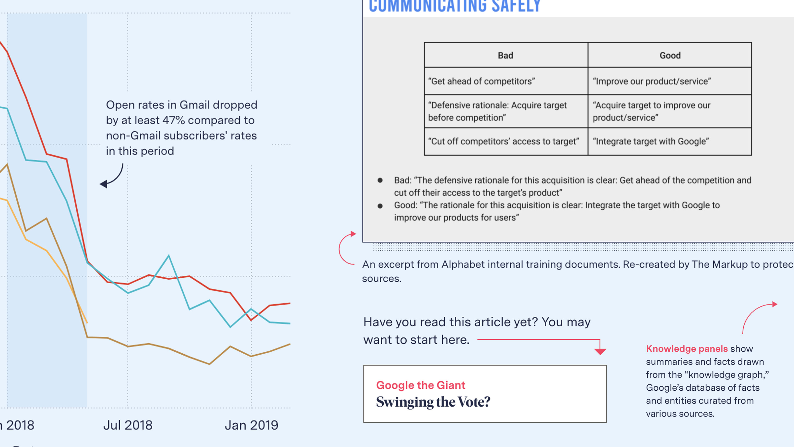
We use annotations with our graphics to highlight and define points of interest.

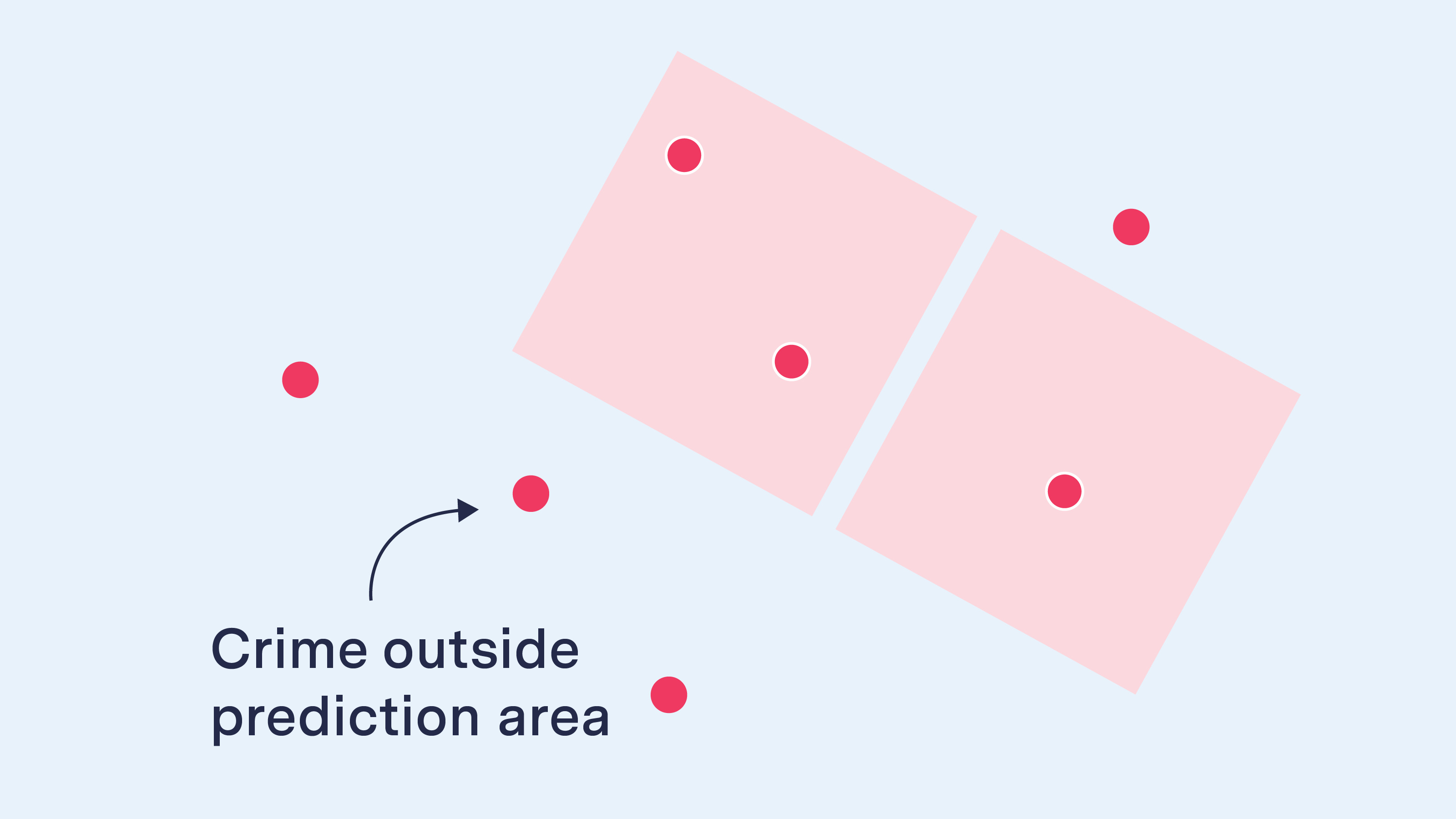
Arrows for annotations
Arrows can be straight lines that follow right angles or they can be 90- or 180-degree curved arrows.

Straight 90 degrees

Straight 180 degrees

Curved 90 degrees

Curved 90 degrees

Text for annotations
Annotation text and arrows should be in Messina Sans Regular, Semibold or Bold in our Navy Blue.

This text is in Messina Sans Bold in our Navy Blue

This text is NOT in Messina Sans Semibold in our Navy Blue

Text boxes
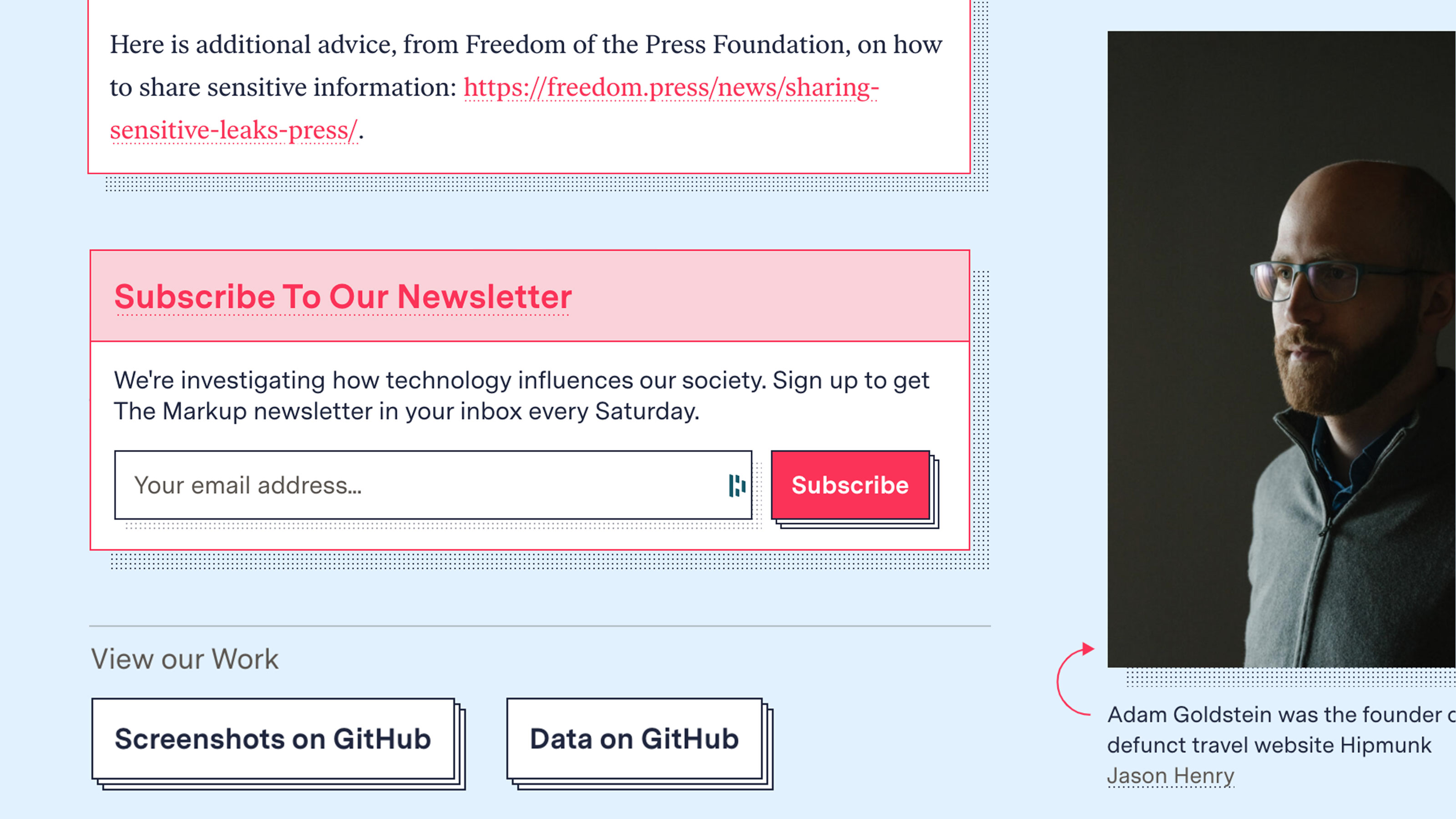
If the graphic is too busy, place the annotation in a white text box so that it stands out.